Last year, I ran across an article in the Economist celebrating 3 of the best graphics from history. Who were the lucky winners? Minard’s depiction of the fate of Napoleon’s army, Florence Nightingale’s diagrams of mortality in the armies, and Playfair’s chart of wages of mechanics and prices of wheat. For those without access to premium Economist online archives, you can find these as well as other historical graphs on the York University Department of Mathematics’ website. Some of these graphs are flawed (Playfair, for example, used different sets of scales when charting wages and prices, which may visually contradict his conclusion that wheat has gotten more affordable), but the bottom line is, they pioneered new ways of representing information.
At around the same time I read the Economist article, I purchased a few of Edward R. Tufte’s books on information display—Envisioning Information, Beautiful Evidence, The Visual Display of Quantitative Information, and Visual Explanations: Images and Quantities, Evidence and Narrative. Although I haven’t gone through all of them, I do recommend them for their wealth of illustrations and chart examples. Beautiful Evidence may be of particular interest to art lovers, especially those who appreciate Leonardo DaVinci’s drawings of inventions, etc. I have to admit though, as in the case of GEB, don’t expect too much new information / insights if you are a visual arts nut.
More recently, I have run across some very amazing charts. They convey messages that elicit both intellectual and emotional responses from the viewers without the aid of any explanatory voice overs—truly worth a thousand words! If anyone wants to contribute, I will update this post with new charts and give due credit :)
 Source: JPMorgan
Let's see how the banks have performed...
http://projects.flowingdata.
Walmart is taking over the world, an interactive chart.
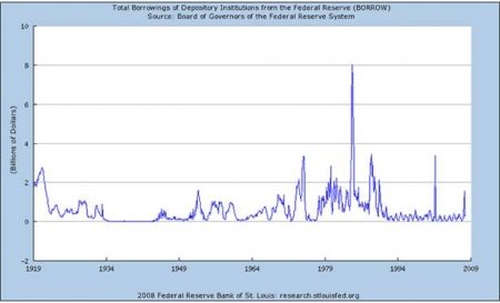
Federal Borrowing through Dec. 2007
Federal Borrowing through December 2008
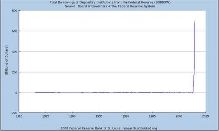 These two charts function as a pair. Need I say more? Source: seekingalpha.com
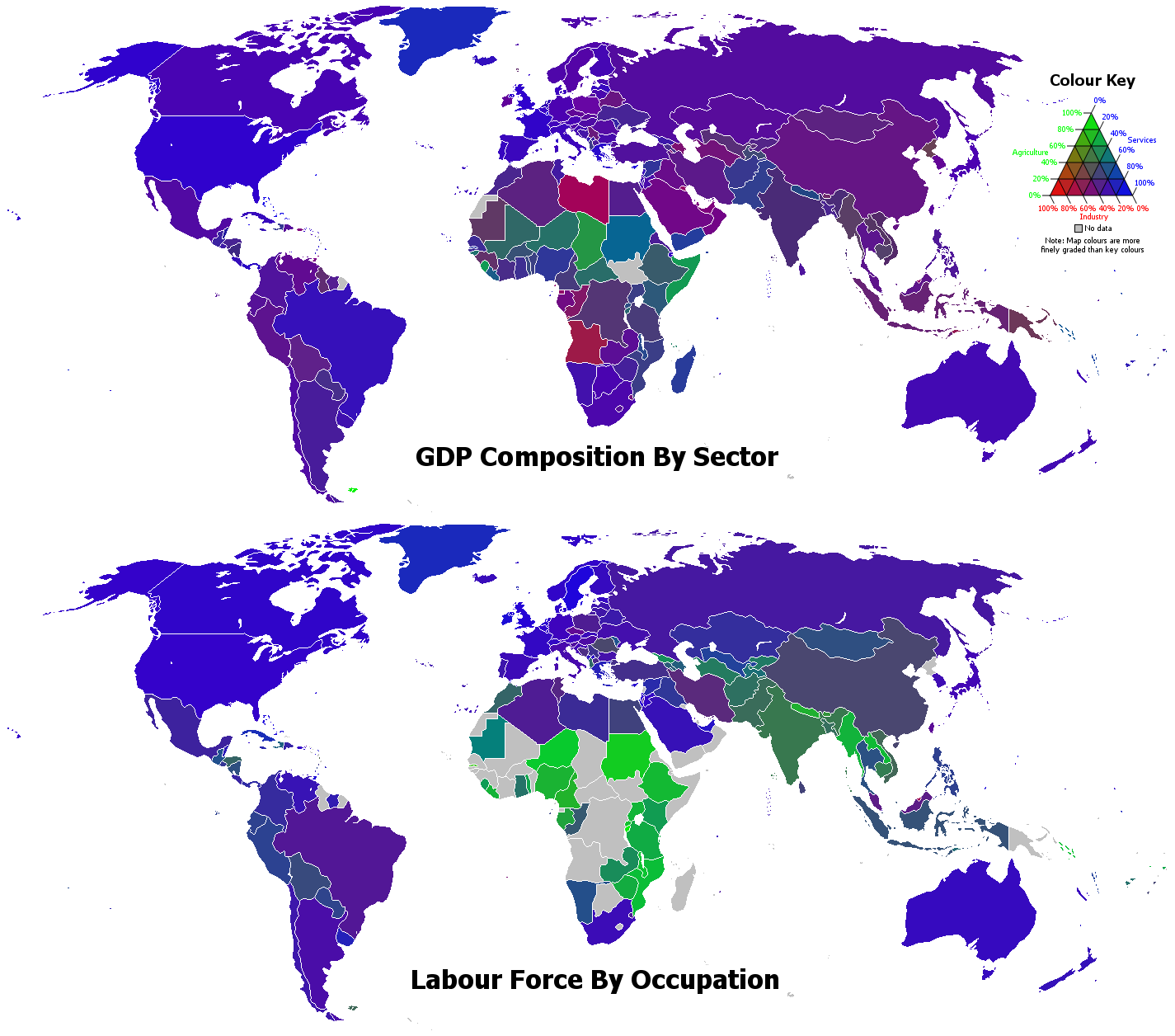 Arthur: Stephen Morley
Color-coding maps may not be something new, but the legend is certainly innovative.
http://www.karlhartig.com/chart/chart.html
While Hartig’s charts aren’t always as innovative as some of the others I have just shown, they do visualize some rather interesting relationships, such as how events and the economy contribute to people’s opinions about the president and how consumers change their purchasing behavior in the music industry over the course of time.


No comments:
Post a Comment