Ever heard of a group of crows being referred to as a "murder of crows" or a bunch of bananas referred to as a "hand of bananas"?
Nope, me neither, until I looked more closely at a catch of collective nouns in English called terms of venery.
Terms of venery, a subset of collective nouns that are object specific, were originally used by hunters to distinguish themselves from the more common folks. Although initially only a few of the words were intended describe groups (the others described characteristics), history is like a game of telephone and now all of the terms are regarded as collective nouns. In this day and age, writers have taken up the torch to invent more terms of venery, often of a humorous nature, so it is not surprising that the words we have for some things are rather bizarre and tongue-in-cheek.
I've hand-picked a list for your amusement and highlighted a few I thought interesting:
Getting corporate and political:
* bank of swans
* business of ferrets
* coalition of cheetahs
* corp of giraffes
* company of parrots
* congress of baboons
* conspiracy of ravens
* parliament of owls
* posse of police
Getting very discriptive:
* abomination of clergy
* ambush of widows
* bloat of hippopotami
* blush of boys
* clashing of economists
* circus of puffins
* converting of preachers
* destruction of cats (feral)
* disguising of tailors
* embarrassment of riches
* equivocation of politicians
* fidget of altar boys
* flap of nuns
* giggle of girls
* illusion of painters
* implausibility of gnus
* murder of crows
* muscle of marines
* mutation of thrush
* neverthriving of jugglers
* obstinacy of buffaloes
* ponder of philosophers
* poverty of pipers
* shrewdness of apes
* shuffle of bureaucrats
* skulk of friars
* threatening of courtiers
What?
* badelynge of ducks (on the ground)
* bale of turtles
* barren of mules
* bob of seals
* bury of rabbits
* caste of flower-pots
* clowder of cats
* confab of doctors
* confraternity of smokers
* cornucopia of slugs
* descent of relatives
* draught of butlers
* earth of foxes
* fall of lambs
* fun of fish
* generation of vipers
* hand of bananas
* heard of harlots
* machination of monkeys
* multiply of husbands
* mute of hounds
* rhumba of rattlesnakes
* sleuth of bears
* unkindness of ravens
* wolfpack of submarines
* zeal of zebras
Thursday, March 19, 2009
Friday, March 6, 2009
All About Charts
As a consultant, about a quarter, if not more, of my time is spent wrestling with ways to present complex information to clients that will lead to more than just acknowledgments that we did the work. Not to belittle market research firms (data collection is crucial in the business world), but it is usually a negative thing if one of our reports comes out looking like market research. The key rests in the difference between pure data dump and focused visualizations that transmit insights and sometimes act as calls to action. As such, I have always taken a particular interest in new ways of presenting information visually. This post hashes together some of my encounters with chart magic (data visualization).
Last year, I ran across an article in the Economist celebrating 3 of the best graphics from history. Who were the lucky winners? Minard’s depiction of the fate of Napoleon’s army, Florence Nightingale’s diagrams of mortality in the armies, and Playfair’s chart of wages of mechanics and prices of wheat. For those without access to premium Economist online archives, you can find these as well as other historical graphs on the York University Department of Mathematics’ website. Some of these graphs are flawed (Playfair, for example, used different sets of scales when charting wages and prices, which may visually contradict his conclusion that wheat has gotten more affordable), but the bottom line is, they pioneered new ways of representing information.
At around the same time I read the Economist article, I purchased a few of Edward R. Tufte’s books on information display—Envisioning Information, Beautiful Evidence, The Visual Display of Quantitative Information, and Visual Explanations: Images and Quantities, Evidence and Narrative. Although I haven’t gone through all of them, I do recommend them for their wealth of illustrations and chart examples. Beautiful Evidence may be of particular interest to art lovers, especially those who appreciate Leonardo DaVinci’s drawings of inventions, etc. I have to admit though, as in the case of GEB, don’t expect too much new information / insights if you are a visual arts nut.
More recently, I have run across some very amazing charts. They convey messages that elicit both intellectual and emotional responses from the viewers without the aid of any explanatory voice overs—truly worth a thousand words! If anyone wants to contribute, I will update this post with new charts and give due credit :)
 Source: JPMorgan
Let's see how the banks have performed...
http://projects.flowingdata.com/walmart/
Walmart is taking over the world, an interactive chart.
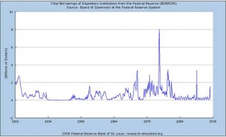
Federal Borrowing through Dec. 2007

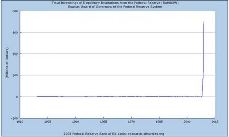
Federal Borrowing through December 2008 These two charts function as a pair. Need I say more? Source: seekingalpha.com
 Arthur: Stephen Morley
Color-coding maps may not be something new, but the legend is certainly innovative.
http://www.karlhartig.com/chart/chart.html
While Hartig’s charts aren’t always as innovative as some of the others I have just shown, they do visualize some rather interesting relationships, such as how events and the economy contribute to people’s opinions about the president and how consumers change their purchasing behavior in the music industry over the course of time.
Last year, I ran across an article in the Economist celebrating 3 of the best graphics from history. Who were the lucky winners? Minard’s depiction of the fate of Napoleon’s army, Florence Nightingale’s diagrams of mortality in the armies, and Playfair’s chart of wages of mechanics and prices of wheat. For those without access to premium Economist online archives, you can find these as well as other historical graphs on the York University Department of Mathematics’ website. Some of these graphs are flawed (Playfair, for example, used different sets of scales when charting wages and prices, which may visually contradict his conclusion that wheat has gotten more affordable), but the bottom line is, they pioneered new ways of representing information.
At around the same time I read the Economist article, I purchased a few of Edward R. Tufte’s books on information display—Envisioning Information, Beautiful Evidence, The Visual Display of Quantitative Information, and Visual Explanations: Images and Quantities, Evidence and Narrative. Although I haven’t gone through all of them, I do recommend them for their wealth of illustrations and chart examples. Beautiful Evidence may be of particular interest to art lovers, especially those who appreciate Leonardo DaVinci’s drawings of inventions, etc. I have to admit though, as in the case of GEB, don’t expect too much new information / insights if you are a visual arts nut.
More recently, I have run across some very amazing charts. They convey messages that elicit both intellectual and emotional responses from the viewers without the aid of any explanatory voice overs—truly worth a thousand words! If anyone wants to contribute, I will update this post with new charts and give due credit :)
 Source: JPMorgan
Let's see how the banks have performed...
http://projects.flowingdata.
Walmart is taking over the world, an interactive chart.
Federal Borrowing through Dec. 2007
Federal Borrowing through December 2008
 These two charts function as a pair. Need I say more? Source: seekingalpha.com
 Arthur: Stephen Morley
Color-coding maps may not be something new, but the legend is certainly innovative.
http://www.karlhartig.com/chart/chart.html
While Hartig’s charts aren’t always as innovative as some of the others I have just shown, they do visualize some rather interesting relationships, such as how events and the economy contribute to people’s opinions about the president and how consumers change their purchasing behavior in the music industry over the course of time.
Thursday, March 5, 2009
J. M. W. Turner (1775-1851)
Joseph Mallord William Turner was an English Romantic painter whose impressionistic seascapes place him stylistically closer to Monet than to his contemporaries. Turner's works are filled with the magnificence of light, whether they are depictions of waves crashing against splendid naval fleets or shipwrecks being swallowed by the furious seas. In college, I used to go to the Yale Center for British Art (BAC) and sit alone for hours (well, maybe not hours, but at least a good 30 minutes) losing myself in Turner's seascapes. So much happens on his canvases that I usually find myself feeling overwhelmed by the free play of his brushstrokes and colors. Yet, my eyes never seemed to get enough of the visual feast and would impatiently devour the delightful yet unquestionably powerful images before me. I would often walk away from these sessions feeling the coolness of sea sprays, their brilliant sparkles impressed on my mind's eye.
As I mentioned earlier, Turner's works do not immediately bring to mind the work of his Romantic contemporaries. Gericault's explicit Raft of the Medusa and Delacroix's frenzied Death of Sardanapalus are both dark--one is shrouded in the shadows of weariness and despair while the other is stained by the blood of passion and pride. Yet, fundamentally, they all mark a return from the refined neoclassicism of Jacques David to works filled with intensity and emotion.
I've always been drawn to paintings that are bold, passionate, and seemingly unrestrained, so it is no wonder that I am drawn to Turner, whose works break free of their canvas constraints and gain a life of their own. What I find most admirable about Turner though, is his ability to win over his audience despite being ahead of his time. I am sure he got away with his abstractions partially because his subjects were seascapes. After all, waves and storms are supposed to be chaotic, their forms everchanging, hard to define and impossible to contain.
While at the BAC, I was even fortunate enough to handle and study a Turner watercolor up close (for a class on connoisseurship). I have to admit though, that I was surprised to find Turner using masking fluids. I know it is a common and legit practice, but somehow (as with knowing about renaissance perspective machines), it dims the level of technical genius I have come to expect from my favorite artists. Of course, I should know better than to hold that romantic view. As much as I'd like to believe in artistic "purity," whether related to authorship, where the artist alone worked on his art, or skills, where the artist paints or draws without the aid of tools, the truth is, sometimes the end more than justify the means. Titan's masterpieces are no less amazing even though they were produced in workshops and Da Vinci is no lesser genius for using the camera obscura to aid his drawings.
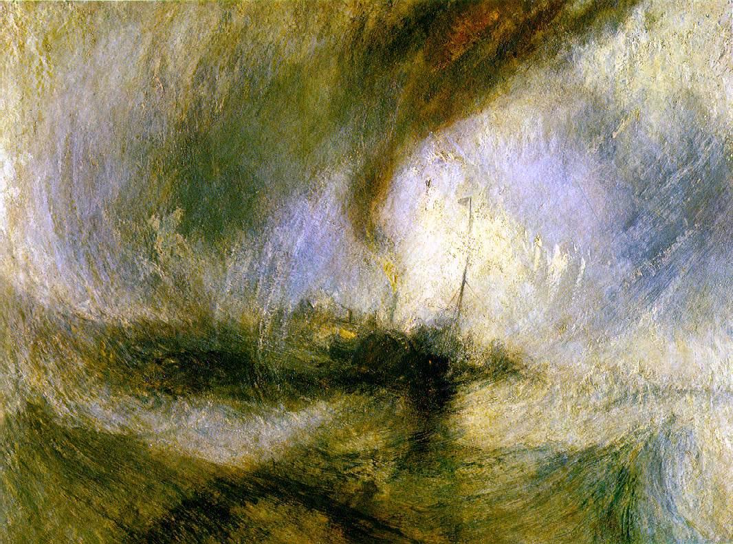
Although I like many of Turner's paintings (he painted at least 600 oils), here are a few that wre particularly abstract:
 Snowstormteam—Boat off a Harbour's Mouth, John Mallord William Turner, 1842, oil on canvas, 91.5 x 122 cm, Tate, London
 Slave Ship—Slavers Throwing overboard the Dead and Dying—Typhoon coming on, John Mallord William Turner, 1840, oil on canvas, 90.8 x 122.6 cm, Museum of Fine Arts, Boston
 Snow Storm: Hannibal and his Army Crossing the Alps, Joseph Mallord William Turner, 1812, oil on canvas,146 x 237.5 cm, Tate, London
As I mentioned earlier, Turner's works do not immediately bring to mind the work of his Romantic contemporaries. Gericault's explicit Raft of the Medusa and Delacroix's frenzied Death of Sardanapalus are both dark--one is shrouded in the shadows of weariness and despair while the other is stained by the blood of passion and pride. Yet, fundamentally, they all mark a return from the refined neoclassicism of Jacques David to works filled with intensity and emotion.
I've always been drawn to paintings that are bold, passionate, and seemingly unrestrained, so it is no wonder that I am drawn to Turner, whose works break free of their canvas constraints and gain a life of their own. What I find most admirable about Turner though, is his ability to win over his audience despite being ahead of his time. I am sure he got away with his abstractions partially because his subjects were seascapes. After all, waves and storms are supposed to be chaotic, their forms everchanging, hard to define and impossible to contain.
While at the BAC, I was even fortunate enough to handle and study a Turner watercolor up close (for a class on connoisseurship). I have to admit though, that I was surprised to find Turner using masking fluids. I know it is a common and legit practice, but somehow (as with knowing about renaissance perspective machines), it dims the level of technical genius I have come to expect from my favorite artists. Of course, I should know better than to hold that romantic view. As much as I'd like to believe in artistic "purity," whether related to authorship, where the artist alone worked on his art, or skills, where the artist paints or draws without the aid of tools, the truth is, sometimes the end more than justify the means. Titan's masterpieces are no less amazing even though they were produced in workshops and Da Vinci is no lesser genius for using the camera obscura to aid his drawings.
Although I like many of Turner's paintings (he painted at least 600 oils), here are a few that wre particularly abstract:
 Snowstormteam—Boat off a Harbour's Mouth, John Mallord William Turner, 1842, oil on canvas, 91.5 x 122 cm, Tate, London
 Slave Ship—Slavers Throwing overboard the Dead and Dying—Typhoon coming on, John Mallord William Turner, 1840, oil on canvas, 90.8 x 122.6 cm, Museum of Fine Arts, Boston
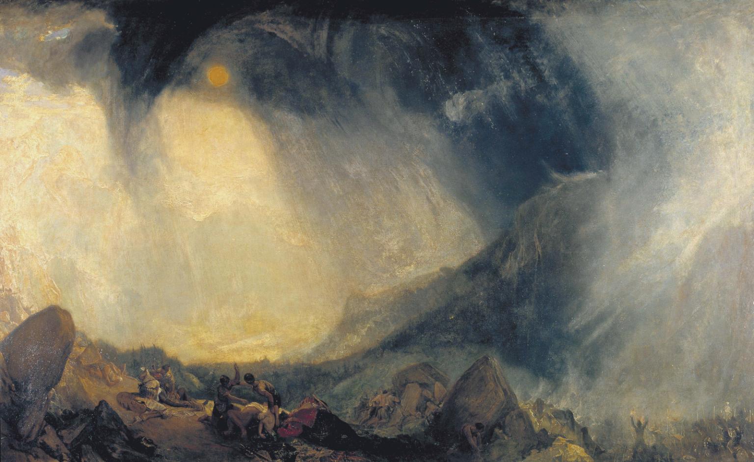 Snow Storm: Hannibal and his Army Crossing the Alps, Joseph Mallord William Turner, 1812, oil on canvas,146 x 237.5 cm, Tate, London
Subscribe to:
Comments (Atom)

